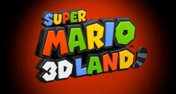
 Nintendo of America has revealed the final logo for Super Mario 3D Land, and boy is it colorful. Yoshiaki Koizumi, game director behind Super Mario 3D Land has gone on record in saying that with the new title his team is focusing on going back to the basics.
As for my thoughts on design that has changed because of the hardware update – I would say that Mario at its core has a very simple, very pop aesthetic and a very functional notion informing it and we may have started to drift from that in some of the Mario console games which are very large and occasionally very complex.
The portable Mario gives us the chance to get back to the very simple basics of the Mario universe.
You won’t find me complaining. My favorite Mario game of all time happens to be Super Mario Bros. 3, so the closer Koizumi’s team can get to that formula the better.
How do you feel about the new logo? Do you like the thought of Super Mario 3D Land taking elements from past Mario games?
