Share your perspective. Keep it thoughtful, welcoming and on topic.
That’s basic? There’s more going on in that boxart than all my other Wii games put together!
Still, I like it, not seeing a logo for ‘Wii Speak Included’ though, I guess maybe that’d be on some outer packaging like Mario Kart.
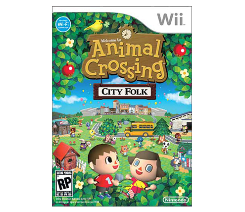
AC: City Folk box art looks good. Can’t complain seeing as how everything you’ll be able to do in the game is there. Arrive in town on the bus, go to the city, and all the other usual stuff you do in Animal Crossing. Really do hope this AC is the cream of the crop this time. I mean Wild World was OK but let’s hope Wii Speak brings a little something more to the table.
Can’t wait for this game and Team Speak.
It looks fine, though I’m not sure that those are three terms I’d use to describe it!
It’s exactly what it is. I like it…not hate it. It clearly shows what the game is about, and what is new by including simple images/graphics that best represent the title. Basic, clean, and to the point.
The little girl in the foreground looks like she’s having some trouble with her eyes. And her balance.
That’s basic? There’s more going on in that boxart than all my other Wii games put together!
Still, I like it, not seeing a logo for ‘Wii Speak Included’ though, I guess maybe that’d be on some outer packaging like Mario Kart.
AC: City Folk box art looks good. Can’t complain seeing as how everything you’ll be able to do in the game is there. Arrive in town on the bus, go to the city, and all the other usual stuff you do in Animal Crossing. Really do hope this AC is the cream of the crop this time. I mean Wild World was OK but let’s hope Wii Speak brings a little something more to the table.
Can’t wait for this game and Team Speak.
It looks fine, though I’m not sure that those are three terms I’d use to describe it!
It’s exactly what it is. I like it…not hate it. It clearly shows what the game is about, and what is new by including simple images/graphics that best represent the title. Basic, clean, and to the point.
The little girl in the foreground looks like she’s having some trouble with her eyes. And her balance.